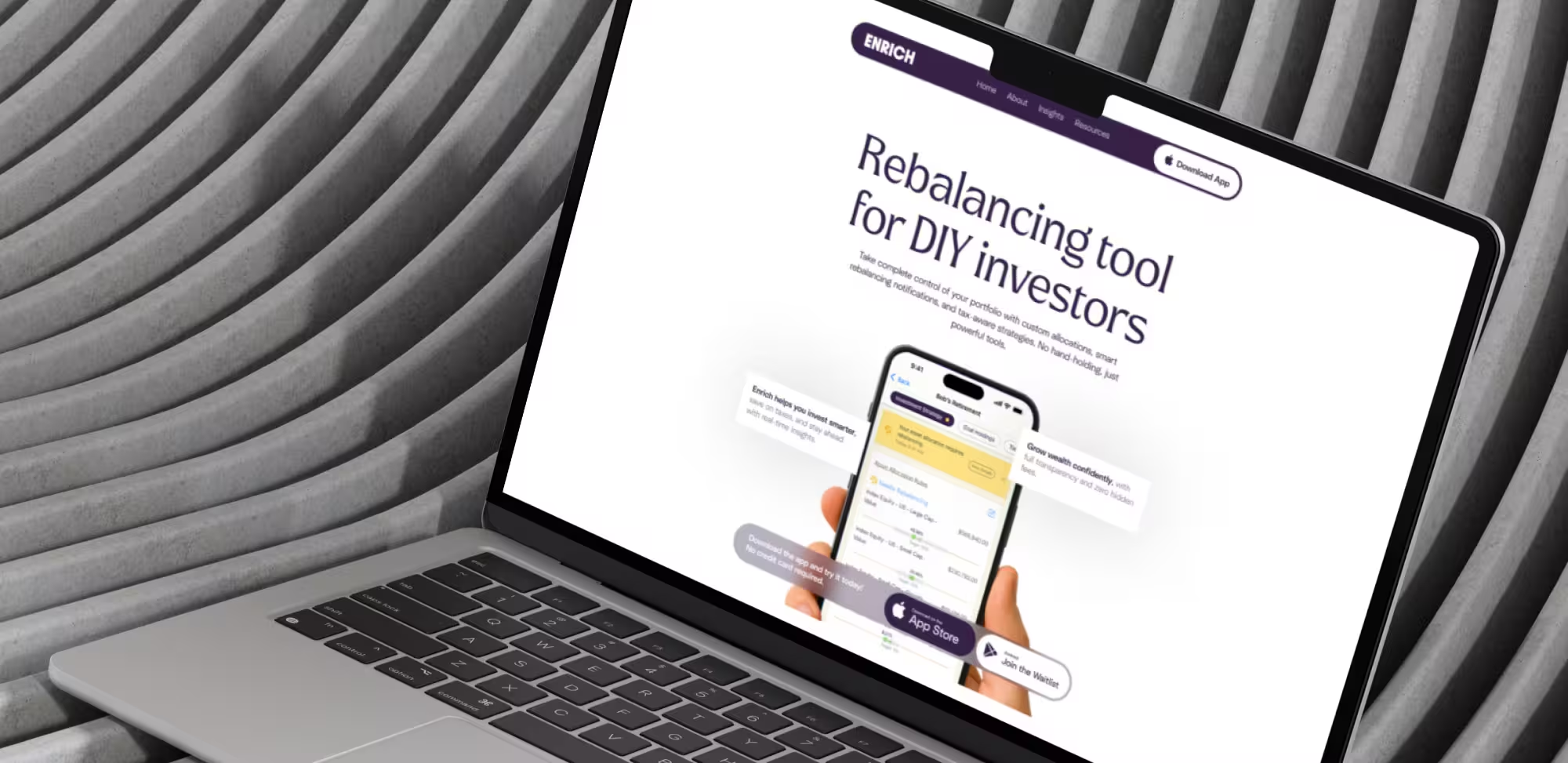
It’s no secret that, especially for Fintech, it’s important to have a clear and attractive website. A good site should include animations, CTA, data visualization, mobile-first design, personalization, product UI illustrations, and many other details.
Smooth animations, hover effects, and scroll interactions make a website feel lively and help users understand the product. Micro-interactions, like animated buttons or feedback after actions, guide users intuitively and build trust. By improving clarity and highlighting key elements, these subtle effects make navigation easier, increase engagement, and encourage visitors to take desired actions, boosting overall conversions.
Clear buttons help users understand the next step and interact with the product quickly. Well placed, visible CTA improve confidence and make the site easier to use. They focus attention on important actions and encourage users to complete them, which directly increases conversions and makes the website more effective.
Organized menus, icons, filters, and search make a website clear and easy to use. Intuitive navigation and a well structured layout help users find information quickly, reduce confusion, and guide them to important actions. By improving usability and making the journey smooth, these design elements increase user engagement.
Illustrations, interactive elements, and UI integrations help show how the product works and make it easier to understand. By clearly presenting features and functionality, users gain confidence and trust in the product. This clarity and engagement encourage visitors to explore more, interact with key elements, and complete desired actions, which directly increases conversions.
Bright gradients, neon colors, and futuristic 3D elements create an emotional impact and make a strong first impression. Eye-catching geometric icons and modern design guide users attention to key areas, making the site more engaging. This visual appeal not only attracts visitors but also encourages interaction with important elements, ultimately increasing conversions.
A strong fintech website is a conversion tool, not just a visual showcase. All these features are focused on a clear structure, well-thought-out animations, and clear CTAs that guide users and build trust. Animations and microinteractions help explain complex products, while UI elements, data visualization, and mobile-first design improve understanding and engagement. When design balances clarity, usability, and visual impact, it directly supports user decisions and business growth.
Ready to move on to your own site?
Book a call and tell us about your project. Tell us the one objection costing you signups, and we'll start there together.
We refreshed the brand guide and built a unified visual system, developed and implemented the site in Webflow with CMS, animations, and new pages, and delivered everything within scope while improving structure, performance, and collaboration from design through to launch.
.avif)
We delivered webflow migration services by refining the existing brand, adding custom animations and Spline 3D, building an informational site with a contact form, and optimizing overall performance.
.avif)
We refined the brand, improving the visual style, rebuilding animations in Webflow and Lottie, and implementing advanced integrations, including HubSpot, Google Analytics, A/B testing, and a custom API-powered calculator, while improving performance across mobile and desktop.