.png)
Fintech apps live on users trust. If something is confusing or feels unsafe, people close the app and don’t come back.
Slow onboarding, messy dashboards, and unclear fees frustrate users. They leave, contact support, and stop trusting the brand. When money is involved, they leave even faster. This scares away potential customers from your service.
When the first steps in a product require too many actions or explanations, users cannot quickly see the value of the service. Long sign-up processes, crowded screens, and unclear flows make people leave the product before they even start using it.
Our solutions: Simplify the onboarding process by removing non‑essential fields and guiding users step by step with clear progress indicators. Focus on only what is needed early, and collect additional information later. This reduces drop‑offs and builds confidence during first use.
Financial services without clear safety signals look risky. If users do not see transparency, data protection confirmation, or clear guarantees, they are not ready to give their money or personal information.
Our solutions: Add clear trust signals at every step: visible security features (like multi‑factor authentication or biometrics), short safety explanations, and compliance badges. Show support options and explain how user data is protected to reassure users.
Many fintech projects speak in tech language, not user language. Complex terms and abstract promises do not clearly show what problem the product solves or why it is better than other options.
Our solutions: Use simple, user‑focused language instead of technical jargon. Explain clearly what problem your product solves and how it benefits users in plain words. Consistent messaging across UX and marketing reinforces value and prevents confusion.
Any delay in financial operations causes doubt and stress. Slow loading pages or unclear action status reduce trust and make the service feel unstable.
Our solutions: Treat speed as a core part of user experience. Optimize load times and show clear feedback like loading indicators, during actions. Fast, responsive interactions help users feel the service is reliable and professional.
Too many features and visual elements make it hard to use the product. Instead of helping the user, the interface distracts and forces them to spend time finding basic actions.
Our solutions: Prioritize key features and remove unnecessary elements. Build an MVP with essential functions first, gather user feedback, and then expand. Keeping the interface clean helps users find what they need quickly and improves retention.
Each of these website design mistakes can lead to lost users, so addressing them is essential. These are the five most common fintech issues we encounter, highlighting the importance of clear focus on industry specifics, user needs, conversion logic, and measuring results from the very beginning.
Ready to move on to your own site?
Book a call and tell us about your project. Tell us the one objection costing you signups, and we'll start there together.
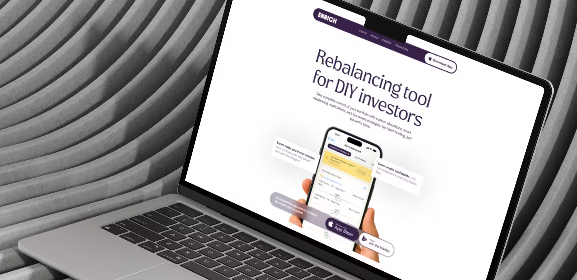
We refreshed the brand guide and built a unified visual system, developed and implemented the site in Webflow with CMS, animations, and new pages, and delivered everything within scope while improving structure, performance, and collaboration from design through to launch.
.avif)
We delivered webflow migration services by refining the existing brand, adding custom animations and Spline 3D, building an informational site with a contact form, and optimizing overall performance.
.avif)
We refined the brand, improving the visual style, rebuilding animations in Webflow and Lottie, and implementing advanced integrations, including HubSpot, Google Analytics, A/B testing, and a custom API-powered calculator, while improving performance across mobile and desktop.